This widget provides a real-time line chart of data from up to 6 user defined channels per graph.
Open the Dashboard Customisation screen and add the widget to the dashboard by selecting the real time line chart option from the drop-down menu.
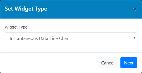
Instantaneous Data Line Chart
Choose the title and description for the chart.
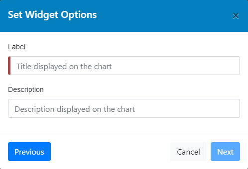
Widget name and description
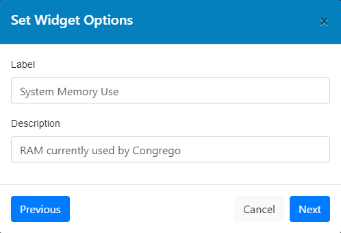
Filled widget name and description details
Then select the channel data to be displayed using the drop-down menus. For each channel, select one of two Y-axis scales to be used.
To set the two Y-axis scales, expand the Y-axis (image) menu and input the desired ranges for each axis.
If the range values are left blank then Congrego® will auto adjust the ranges to suit the data.
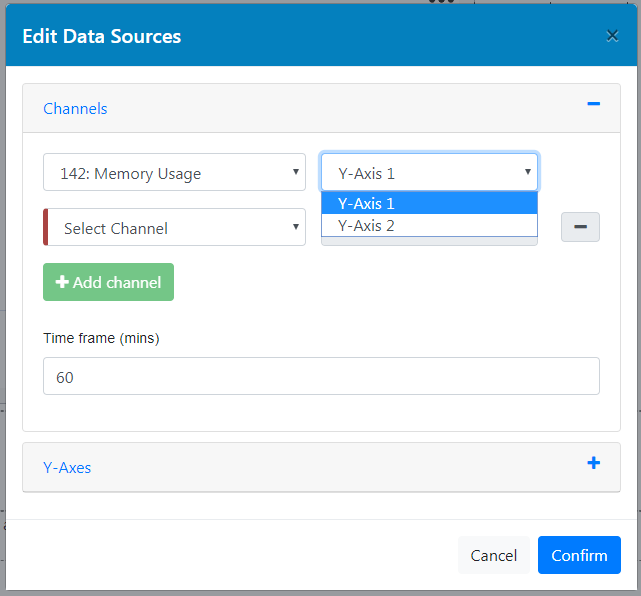 Select Y axis to use |
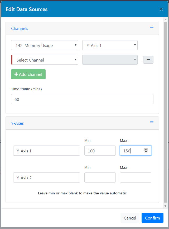 Add Y axis range values |
Adjust position of the widget and then click 'Save' button on the top left of the dashboard.
Once the widget has been saved, the selected channel data will be displayed as a real-time line chart. The colours used for each channel are not currently editable.
By hovering the mouse pointer over the real-time graphics, users can also observe specific values for specific channel data, with the channel information, result, time and date displayed for the point of the line graph selected.
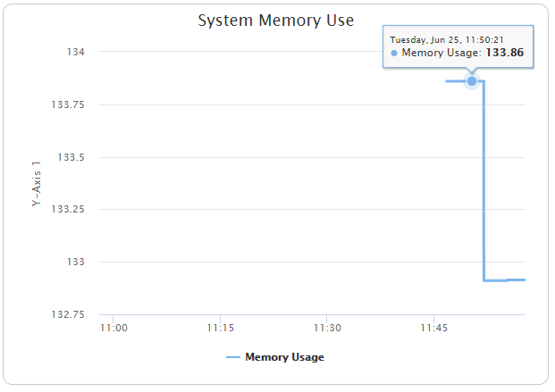
Instantaneous Data Line Chart